Information Cards
Title

About Tech CU
Learn More About Tech CU
In the Community
How We're Involved
Financial Resources
We’ve Made It Easy to Handle Your Finances
News
News from Tech CU
Extra Card Should go to next row
Press ReleasesUsage Instructions
- Add the "Information Cards" widget to your page
- To add a Title above the cards, click the gear icon in the upper right corner
- To add a Card:
- Click the blue and white "+" icon
- Selected Page:Is used to select the page the slide will link to. You can also use fields on the source page to populate this widget:
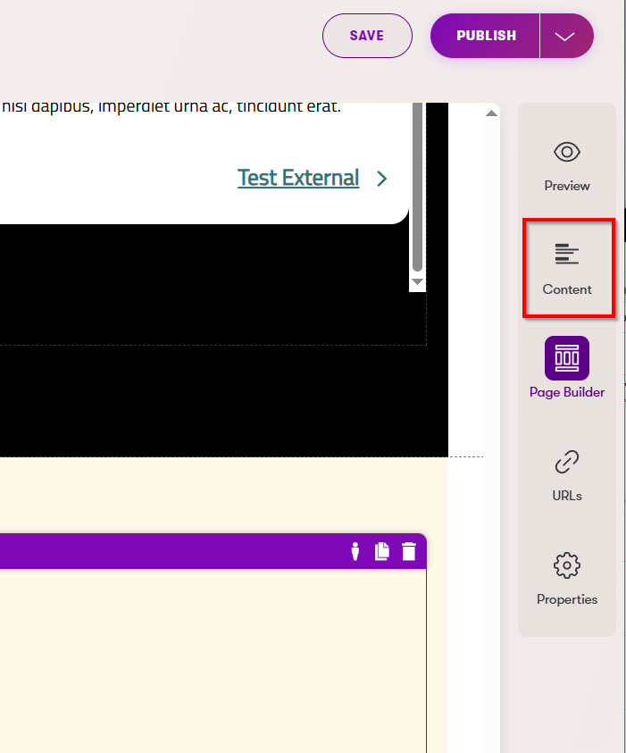
- On the page you want to link to/pull content from, add content to these fields in the Content Tab on the right:

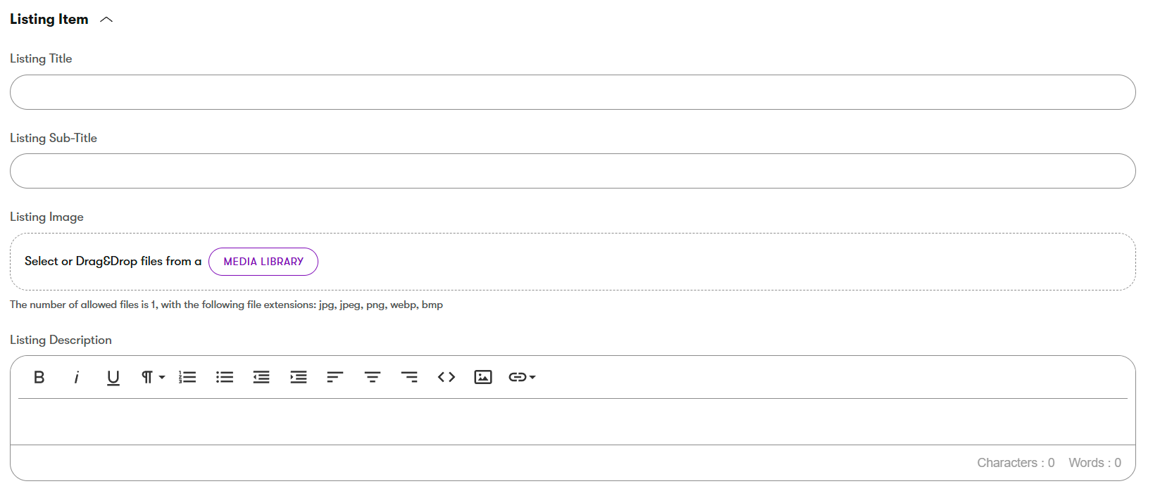
- Fill out the Listing Item fields:

- In your Information Cards widget, click the Page icon to select your source page:

- Fill out the Listing Item fields:
- On the page you want to link to/pull content from, add content to these fields in the Content Tab on the right:
- You can also just add content directly into the Card
- Use the Page Selector above to navigate to the page you want to link to
- Image:Click the image icon to upload or choose an image
- 600px x 330px
- Imgix Settings: See Imgix information
- Title: Enter the title for the top of the card
- URL: For external URLs. For URLs on this site, use the Page Selector mentioned above.
- If external, check the "New Window" checkbox
- Link Text: This text will appear on the button or text link at the bottom of the card
- Link Aria: To be used if the link text offers no context for screenreaders. For example, if a button says just "Learn More", the Link Aria should offer more context, such as "Learn more about checking accounts".
- Repeat as needed
- Notes:
- You can click the gear icon under each card to make edits
- Clicking the minus icon "-" will remove that card
- You can use the up and down arrow icons to rearrange the cards
