Generic Cards
Generic Cards Layout 1, Left aligned
Text Left; Great Rates
We re-invest in our members! See our rates in California, Idaho, Texas, and other states.
Our Rates
Lorem Ipsum Dolor sit amet
Lorem ipsum dolor sit amet, consectetur adipiscing elit. Mauris volutpat augue vitae turpis pulvinar malesuada. Nunc et nisi dapibus, imperdiet urna ac, tincidunt erat.
Test
Lorem ipsum dolor sit amet, consectetur adipiscing elit. Mauris volutpat augue vitae turpis pulvinar malesuada. Nunc et nisi dapibus, imperdiet urna ac, tincidunt erat.
About Tech CU
Generic Cards Layout 1, center aligned
Text Left; Great Rates
We re-invest in our members! See our rates in California, Idaho, Texas, and other states.
Our Rates
Lorem Ipsum Dolor sit amet
Lorem ipsum dolor sit amet, consectetur adipiscing elit. Mauris volutpat augue vitae turpis pulvinar malesuada. Nunc et nisi dapibus, imperdiet urna ac, tincidunt erat.
Test
Lorem ipsum dolor sit amet, consectetur adipiscing elit. Mauris volutpat augue vitae turpis pulvinar malesuada. Nunc et nisi dapibus, imperdiet urna ac, tincidunt erat.
Generic Cards Layout 1, center aligned no button
Text Left; Great Rates
We re-invest in our members! See our rates in California, Idaho, Texas, and other states.
Lorem Ipsum Dolor sit amet
Lorem ipsum dolor sit amet, consectetur adipiscing elit. Mauris volutpat augue vitae turpis pulvinar malesuada. Nunc et nisi dapibus, imperdiet urna ac, tincidunt erat.
Generic Cards Layout 2, left-aligned
Great Rates
We re-invest in our members! See our rates in California, Idaho, Texas, and other states.
Great Rates!
We re-invest in our members! See our rates in California, Idaho, Texas, and other states.
Lorem Ipsum Dolor sit amet
Lorem ipsum dolor sit amet, consectetur adipiscing elit. Mauris volutpat augue vitae turpis pulvinar malesuada. Nunc et nisi dapibus, imperdiet urna ac, tincidunt erat.
Test
Lorem ipsum dolor sit amet, consectetur adipiscing elit. Mauris volutpat augue vitae turpis pulvinar malesuada. Nunc et nisi dapibus, imperdiet urna ac, tincidunt erat.
test
test 1
Generic Cards Layout 2, centered
Great Rates
We re-invest in our members! See our rates in California, Idaho, Texas, and other states.
Great Rates!
We re-invest in our members! See our rates in California, Idaho, Texas, and other states.
Lorem Ipsum Dolor sit amet
Lorem ipsum dolor sit amet, consectetur adipiscing elit. Mauris volutpat augue vitae turpis pulvinar malesuada. Nunc et nisi dapibus, imperdiet urna ac, tincidunt erat.
Test
Lorem ipsum dolor sit amet, consectetur adipiscing elit. Mauris volutpat augue vitae turpis pulvinar malesuada. Nunc et nisi dapibus, imperdiet urna ac, tincidunt erat.
test
test 1
Usage Instructions:
- Add the "Generic Cards" widget to your page
- Click the gear icon to openthe widget config to:
- Add an optional title above the cards
- Select between Stacked (Layout 1) or Slider (Layout 2)
- To add a Card:
- Click the blue and white "+" icon
- Selected Page:Is used to select the page the slide will link to. You can also use fields on the source page to populate this widget:
- On the page you want to link to/pull content from, add content to these fields in the Content Tab on the right:
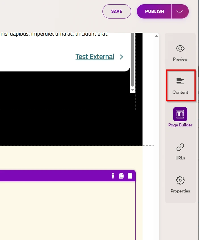
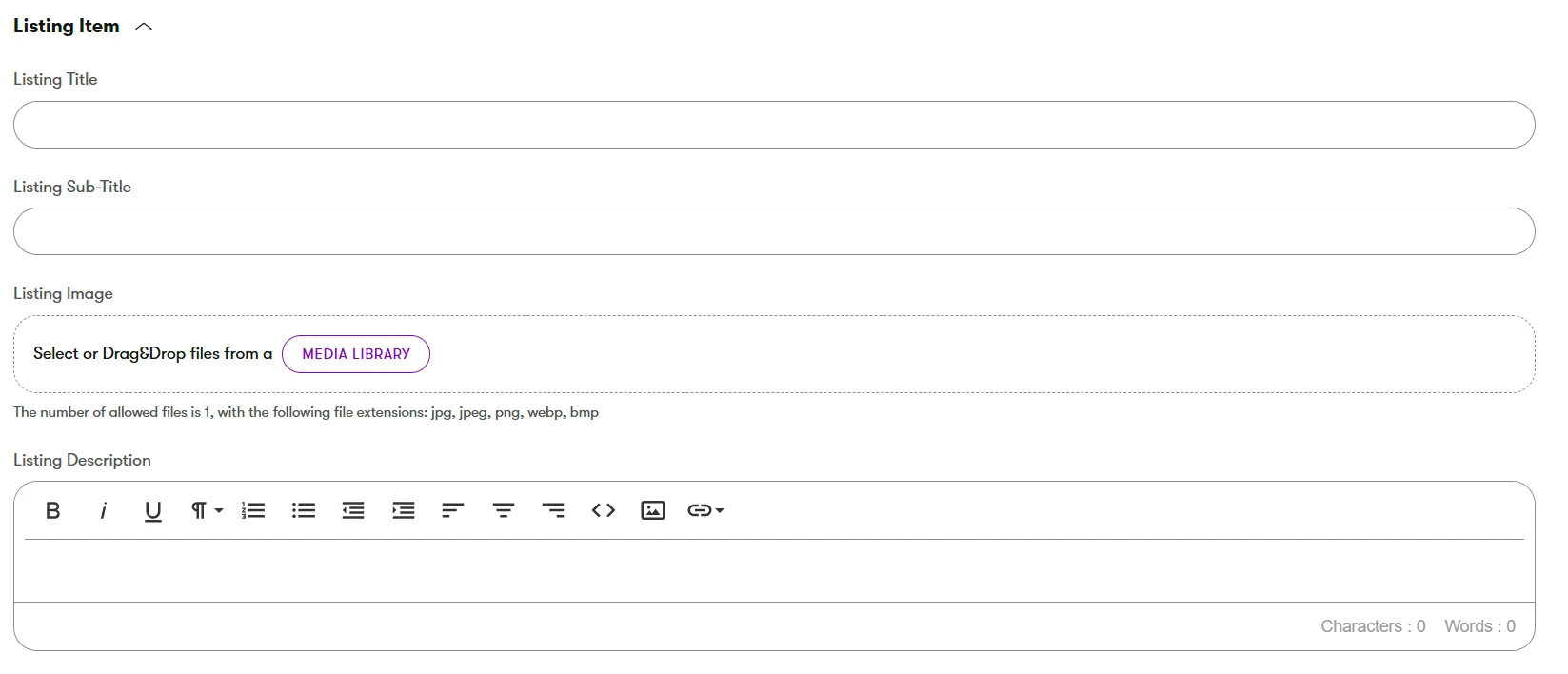
- Fill out the Listing Item fields:
- In your Generic Cards widget, click the Page icon to select your source page:

- Fill out the Listing Item fields:
- On the page you want to link to/pull content from, add content to these fields in the Content Tab on the right:
- You can also just add content directly into the Card
- Use the Page Selector above to navigate to the page you want to link to
- Text Alignment: Choose from Left aligned text or Centered
- Icon: Click the image icon to upload or choose an icon
- Imgix Settings: See Imgix information
- Imgix defaults should not be overridden for icons unless truly necessary
- Title: Enter the title for the top of the card
- Description: The smaller text under the title
- URL: For external URLs. For URLs on this site, use the Page Selector mentioned above.
- If external, check the "New Window" checkbox
- Link Text: This text will appear on the button or text link at the bottom of the card
- Link Aria: To be used if the link text offers no context for screenreaders. For example, if a button says just "Learn More", the Link Aria should offer more context, such as "Learn more about checking accounts".
- Repeat as needed
- Notes:
- You can click the gear icon under each card to make edits
- Clicking the minus icon "-" will remove that card
- You can use the up and down arrow icons to rearrange the cards